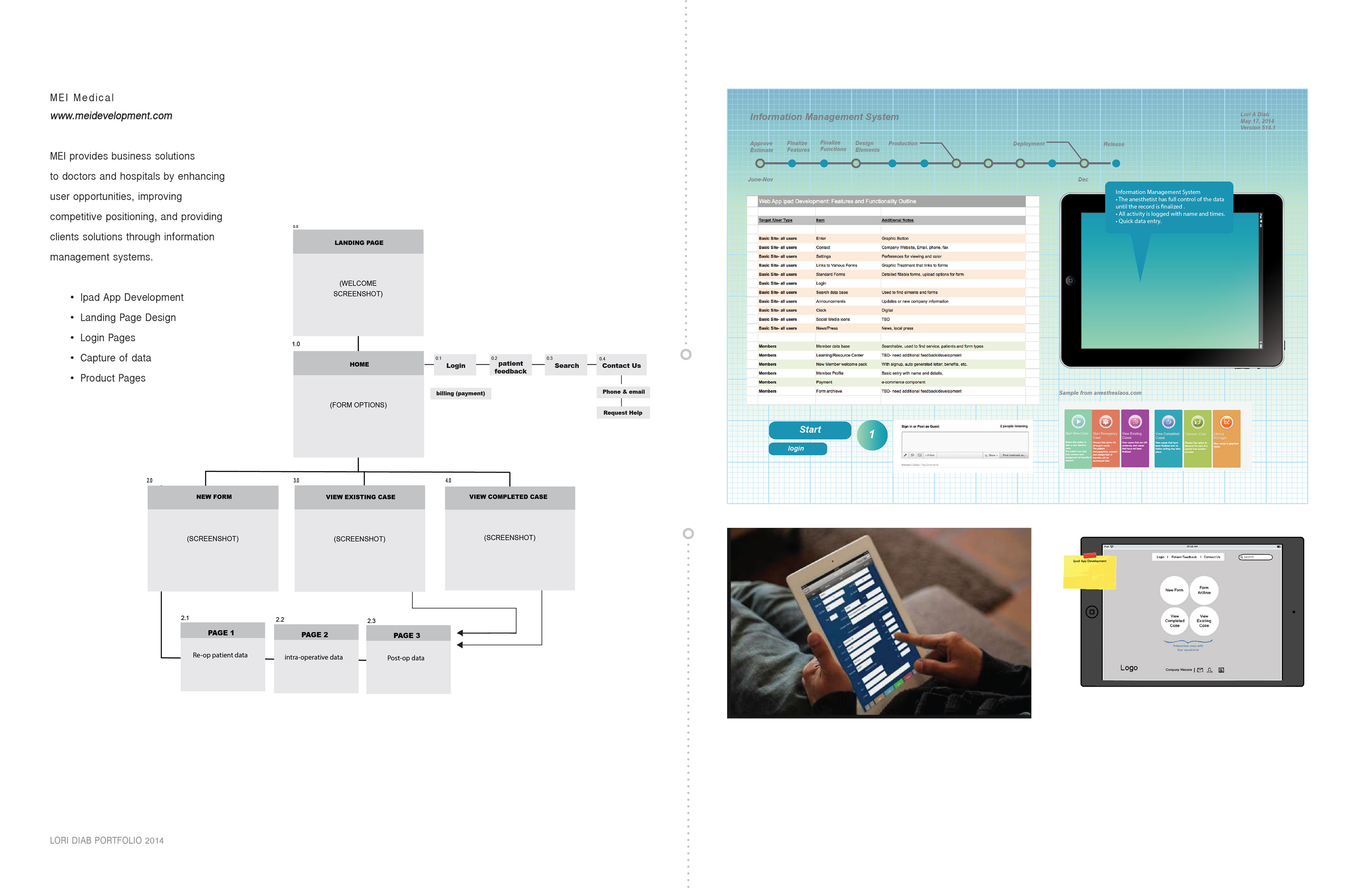
The Problem
MEI Medical was looking for a form design solution for their patient check-in system on an iPad.
By addressing the user experience on how the patient form could look, work and feel while using the application.
Once the new automated check-in procedures are fully integrated into the practice, this application will reduce office waiting times and streamline the personal healthcare patient information process. What are the best design practices and thoughtful strategy patients can use while being patient on this new platform?
The Solution
We addressed the need to limit the navigation of the form order, selection choices, ease of answering questions, and selected a color palette that gives the user precise but restricted options. I created a simple, seamless, and enjoyable experience for users who need to navigate the areas for adding and updating their personal information.
My Role:
UI/UX Designer
User Flowchart ‣ Low-Fidelity Wireframes ‣ Visual Design ‣ Prototype
Tools Used ‣ Adobe Illustrator & Adobe Photoshop
.