The Problem
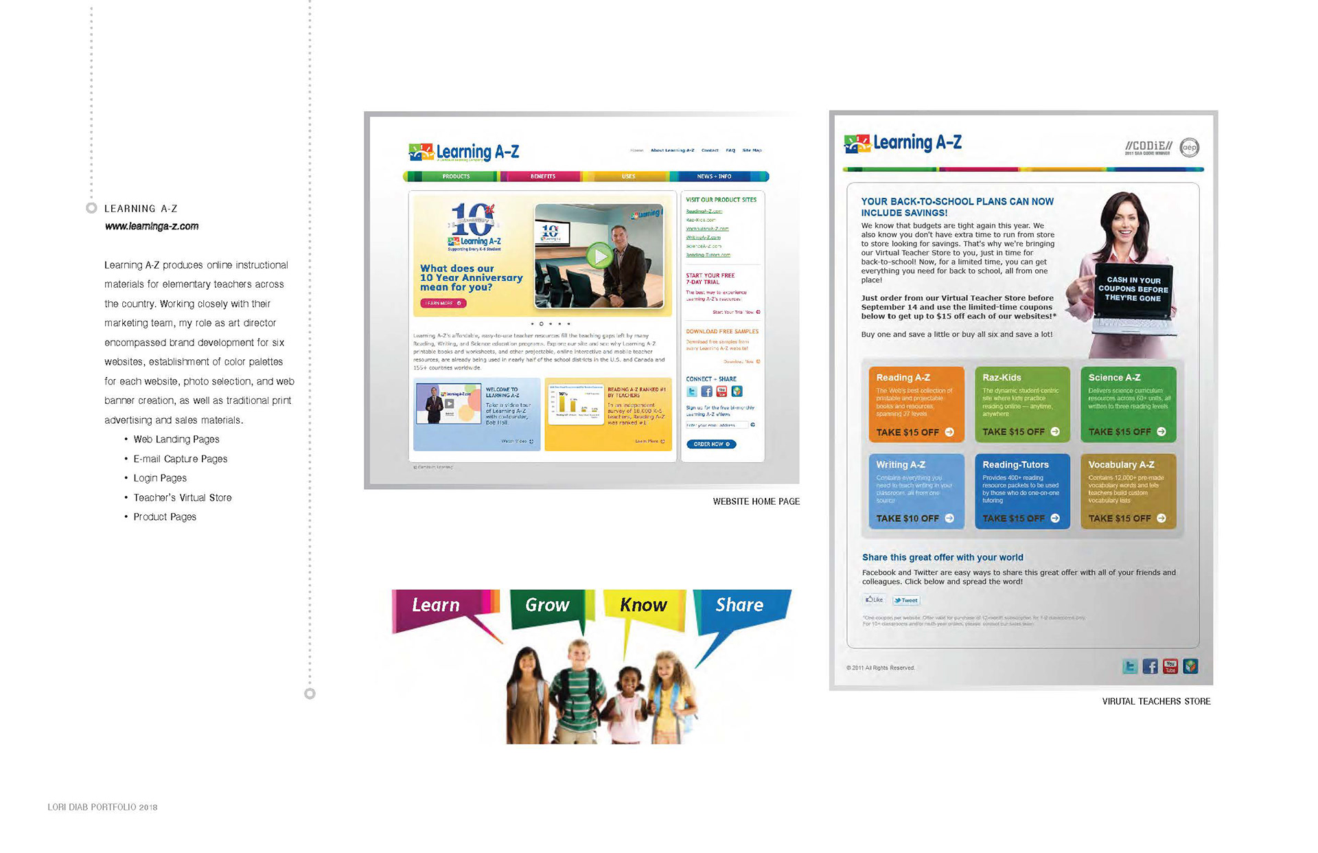
Learning A-Z is an education technology company dedicated to expanding literacy through K-6 online resources. My design challenge was to consider the user experience when purchasing a plethora of products.
On the website, the user should be able to move through the sequence of actions for a quick decision, achieve their objective and, upon subsequent visits, help recall the user interface while keeping the design interface appealing. The visual factors had a big impact with the overall user experience.
The Solution
Working with the development team, we addressed the need to limit the navigation choices, select a color palette that gives the user clear and limited direction. I was able to organize the store page by color-matching from existing subject areas, adding familiar images, organizing the content into manageable chunks and using fonts that make it easy to read. Colors needed to be consistent in order to convey the look and feel of the brand. For the users, they need to get from point A (the entry point) to point B (where they want to be) as quickly and easily as possible and get the teachers back to teaching.
My Role:
UI/UX Designer
User research ‣ Sitemaps ‣ Prototyping ‣ Identity design ‣ Conceptual sketches